Wednesday, February 25, 2009

They Definitely Hit the Spot!!!

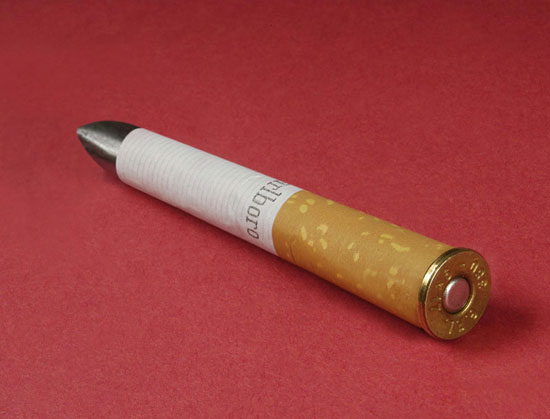
Core77 just posted these pictures and asked the readers to guess what it is. 

I knew right away, a hair straightener! It is made to appeal to 25-35 year olds.

My opinion of why this product will do well.
It's sleek, small, and most importantly,
WIRELESS.

Good job Bluelarix.

Sunday, February 22, 2009

Shock Value


Design Boom profiles a photographer who looks to create shocking images. Robert Gligorov's images usually focus on politics, sexuality, or other hot topics. 


Thursday, February 19, 2009

Friday, February 13, 2009

Sitting Green


Going Green seems to be catching on in every aspect of life. Design Boom featured pictures from The Stockholm Furniture Fair, showing creative designs in the green house exhibition.

The lights are made of plastic bags. I love seeing what people can do with old materials!

Sunday, February 8, 2009

Show V. Story


Seth tells the difference between product ads that are all show, glitz, airy and a product that has a story. The story is much more important than how you tell it. He criticizes super bowl commercials as a waste of time and money, only focused on the way to tell the story (apparently they think the best way is spending millions of dollars on mere seconds!).

Saturday, February 7, 2009

Color Matters


This article from Core77 notes a study printed in the Times about effects of color on people.

Some points:
- "Red can make people's work more accurate, and blue can make people more creative."
- Athletes wearing red win 60% of the time over those wearing blue.
- Men found women hotter in photographs containing red.

Then there is is a study on how the color of the bar people were in made people do different things (be more social, eat more, etc).

I really don't think tests like these can be accurate, there are too many outside variables. But the results are interesting still, but I just wouldn't read them as fact.

Thursday, February 5, 2009

Logo and Colors


Here is our logo! I really like it because it's even to read even with the bit of erosion feel the font has to it.

The color choices are going to be: monochrome and blue. This is taking from the theme of what most jazz posters were like. So the colors will be classic, but the design of the site will be more modern, going in the 'acid' part of it (the addition of hip hop / electronic / etc)